Tuesday, June 2, 2015

Finishing the Final Project


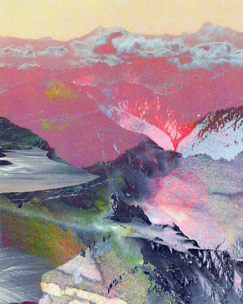
I am putting the finishing touches on my final project. These photos represent my process. I examined both of these focal-point ideas, and had a difficult time choosing the better version. Taking photos and flipping through them on my phone really helped me see which one works better. I chose the to go with the 2nd option because it ties in the red-orange from the rest of the piece, and since the background has so much cool pthalo-blue, it provides a bit of complimentary color pairing.

Collage Evolution


It was my critique group's idea to skew my vertical painted pieces (trees and bones) so that they are diagonal to create more visual interest. I don't love how this looks but I'm going to keep tinkering with it till I do. Collage is presenting a huge challenge to me because I'm so hesitant to glue anything down. I think I could rearrange the pieces forever and not be 100% satisfied with it. I don't like how the diagonal-version of my piece looks like its divided into flat panels, rather than a continuous space, if that makes sense? I want to achieve some sense of depth.

Friday, May 29, 2015

More Robert Goodnough


The Club by Robert Goodnough


Variables with Color by Robert Goodnough


Mambo by Robert Goodnough

Robert Goodnough


Grey Development by Robert Goodnough (Portland Art Museum)

This is my second source of inspiration for my final project. I love how sophisticated and complex this collage is! Its very difficult to discern the different values of the grey pieces when seen in person. The shifts are extremely subtle and effective.

Monday, May 18, 2015

Sharon Sieben


Regal by Sharon Sieben

http://www.ugallery.com/oil-painting-regal

Finished Simultaneous Contrast!


I've never been interested in collage before but I actually had a blast making these projects and think I will continue to explore painted collage in my personal art projects.

Tuesday, May 12, 2015

Monday, May 11, 2015

David Hockney


Red Pots in the Garden by David Hockney 

http://www.hockneypictures.com/home.php

I think this piece shows me how the concept of our project, recreating spaces, can be used as a springboard to make some really beautiful dreamlike landscape/spatial art outside of the classroom.

Value and Color


I am very surprised to see how rich the values are in my color-painting piece upon taking a BW photo! I was so frustrated when I was painting with green and red and couldn't get any deep black tones from it, but I guess the browns were actually quite dark, looking at this photo.

Outside Lies Magic- Completed


Feels good to be done with this extensive project! I liked seeing how dreamlike all of the imagery was in the projects of my classmates.

Thursday, May 7, 2015

Jerome Myers


In Lower New York by Jerome Myers (at Portland Art Museum)

I really enjoyed looking at this piece as it relates to my American Identities (SINQ) class. In that class, we talk about the Gilded Age and tenement houses and such, so it was exciting to see art at PAM with a greater understanding of historical context and significance. The tenements were horrible to live in from what I've read yet Myers paints this scene with optimism and a warm happy color palette. The children playing are painted so brightly, it almost speaks to his hope for the future of New York. 

Wednesday, May 6, 2015

Portland Art Museum exploration


Cart with Black Ox by Vincent van Gogh at the Portland Art Museum.


A painting of similar content but an extremely different color palette and overall tone
Cart with Red and White Ox by Vincent van Gogh 
(this piece is in Otterlo, Netherlands, very far away from the similar piece in Portland, which is a shame because I'd love to compare the color/mood-relationship in person somehow if I could)

Sunday, May 3, 2015

Van Gogh with Complimentary Colors


The Night Cafe by Vincent Van Gogh

Henri de Toulouse-Lautrec

At the Moulin Rouge, The Dance - Henri de Toulouse-Lautrec

At the Moulin Rouge, The Dance by Henri de Toulouse-Lautrec

Toulouse-Lautrec's use of red/green complimentary pallette is terribly inspiring to me, the way he makes the two colors live so harmoniously together. His use of transparency in painting is also very cool. The shadows of dancers in the middle-left and the woman's black dress on the right and the way they are painted almost transparently is amazing.

Moving Forward to Color


Here are a few shots of the collected pieces of this project. I started into the color portion and got pretty far because I had already mixed up so many colors for the color sample so I though why waste paint? I think I might have too many pure reds in my color project and I was having trouble getting super-dark earth tones from my paints. Perhaps my red is too warm but I was hesitant to add a little cool red to make a better dark earth tone in case that would ruin the integrity of my project. I like to imagine the dark reds as representing the rust taking over my decayed magical world and the greens representing the parasitic vines and moss suffocating the cement steps and fences.

Color Samples


When I originally did my color sampling assignment I neglected to first look over the online assignment-- which stated to paint the colors over a mid-tone hue. To rectify my mistake I had to cut and paste my color samples on to a mid-tone hue colored paper but in doing so I was able to really compare color swatches and toss ones too similar and construct a logical arrangement of my hues. I am glad I had to rearrange everything because now I have a better understanding of how to remake these hues/values since they are arranged logically.


Laura Kicey


Pimento by Laura Kicey (from her Constructs series)

http://laurakicey.com/


Outside Lies Colorful Magic


For my Outside Lies Magic project part 2, I decided to use red and green as my complimentary color pair. I chose this set because in my personal painting I've tried using red/green palettes and failed to create harmony. I think that's because before I did not realize you can't assume the "primaries" of paint that come straight out of the paint tube are true "primaries." I also find red/green interesting because of how stressful the two colors can be together sometimes if too much pure color is used. The earth tones derived from red/green are exceptionally beautiful and I'm excited to paint with them. 

Friday, April 24, 2015

Daniel Dust

"Of Majesty and Malice" 48"x90" Acrylic on Canvas

Of Majesty and Malice by Daniel Dust

"Flower and Flame" 24"x48" Acrylic on Canvas

Flower and Flame by Daniel Dust
(Currently featured at the Sparks Gallery in San Diego, CA.)

Dust's works are mind-blowing when seen in person. His "hyper-real" paintings are strikingly honest and accessible in what they are trying to say to the public. 

Thursday, April 23, 2015

Seher Shah


The Complete Oracles by Seher Shah


Jihad Pop Progression 4 by Seher Shah

http://www.sehershah.net/

Monday, April 20, 2015

tchmo (a little collage inspiration)

art landscape mountains print digital collage tchmo

tchmo, Untitled (Landscape) 20100401

Outside Lies Adventures


(my journal entry)


Outside Lies Magic photos


A simple and rarely used cement staircase leading up a residential hill.


Getting to the top of the stairs was a tiresome adventure but the lovely views of downtown Portland was well worth the trek.

Saturday, April 18, 2015

Miss Van


Artwork by international street artist Miss Van. I love seeing how her work evolves as it develops from street art to oil on canvas. I've never seen her work in person but I've seen tattoos of her work once or twice that are simply lovely, her work translates well into body art. Miss Van started doing street art over twenty years ago and her work has really evolved over the years.